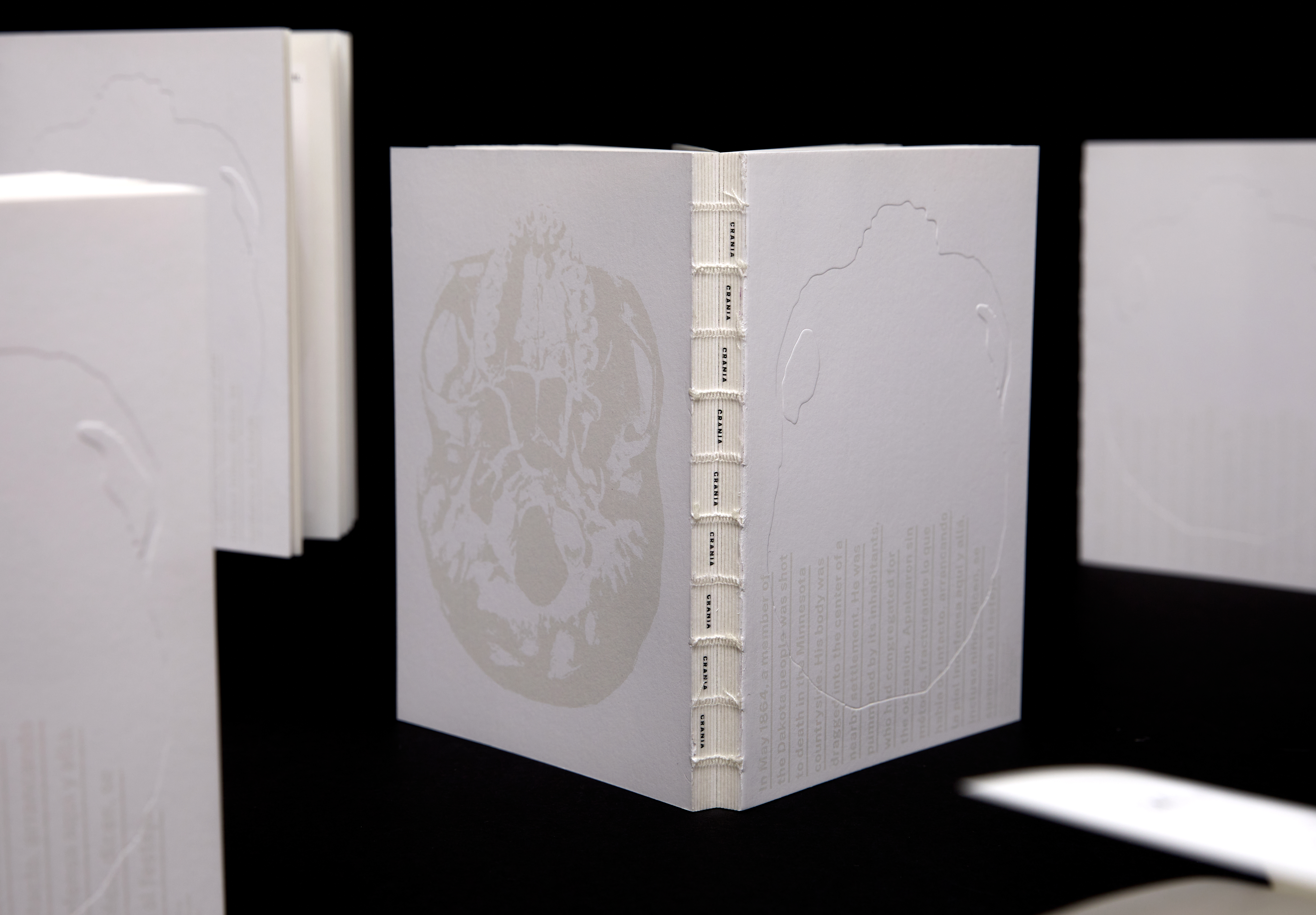
History is always written by the victors. While conceptualizing CRANIA, we wanted to make a book that would speak graphically from the opposite perspective. The cover speaks to our failure as a society founded on colonialism:
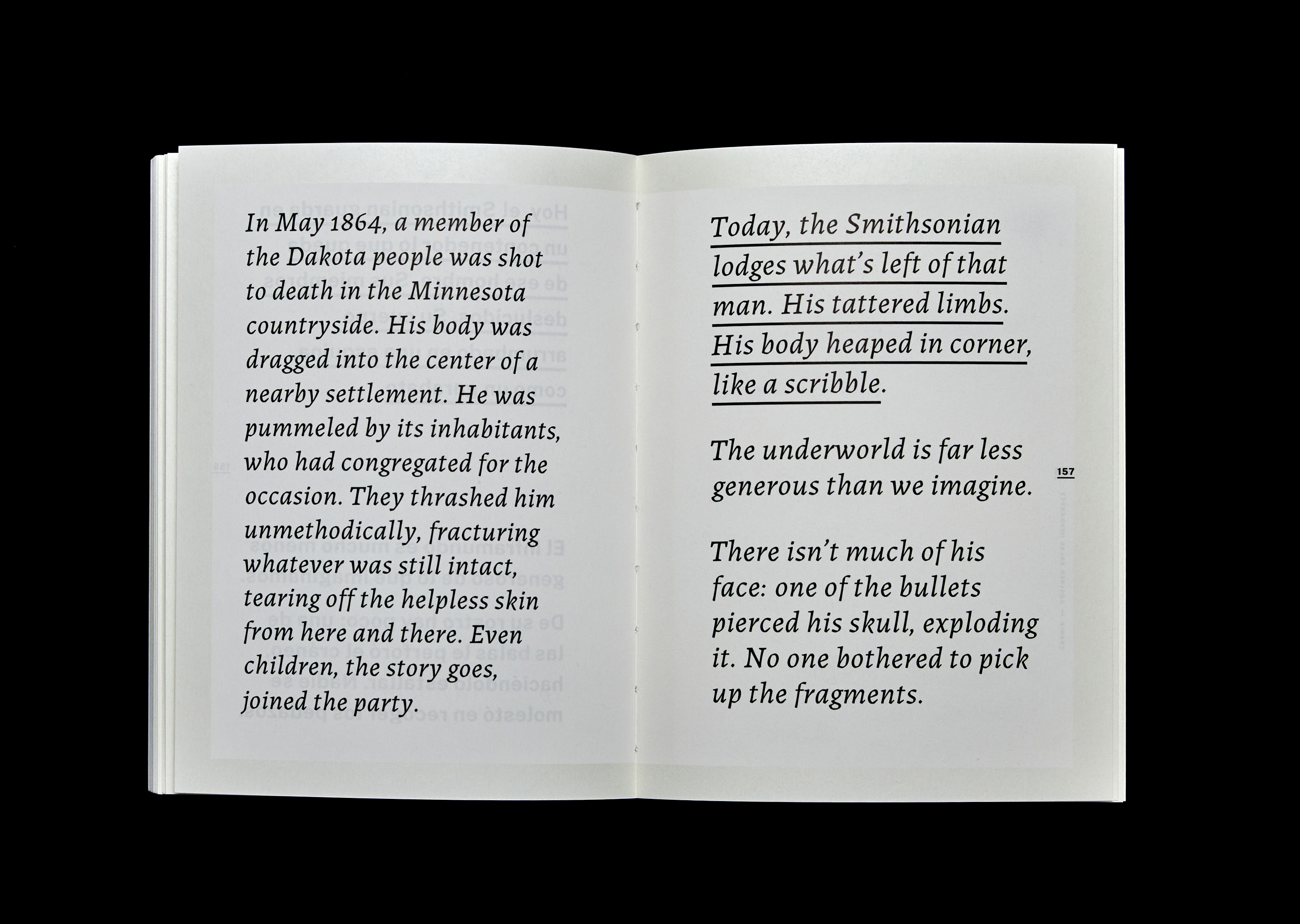
“In May 1864, a member of the Dakota people was shot to death in the Minnesota countryside. His body was dragged into the center of a nearby settlement. He was pummeled by its inhabitants, who had congregated for the occasion.”
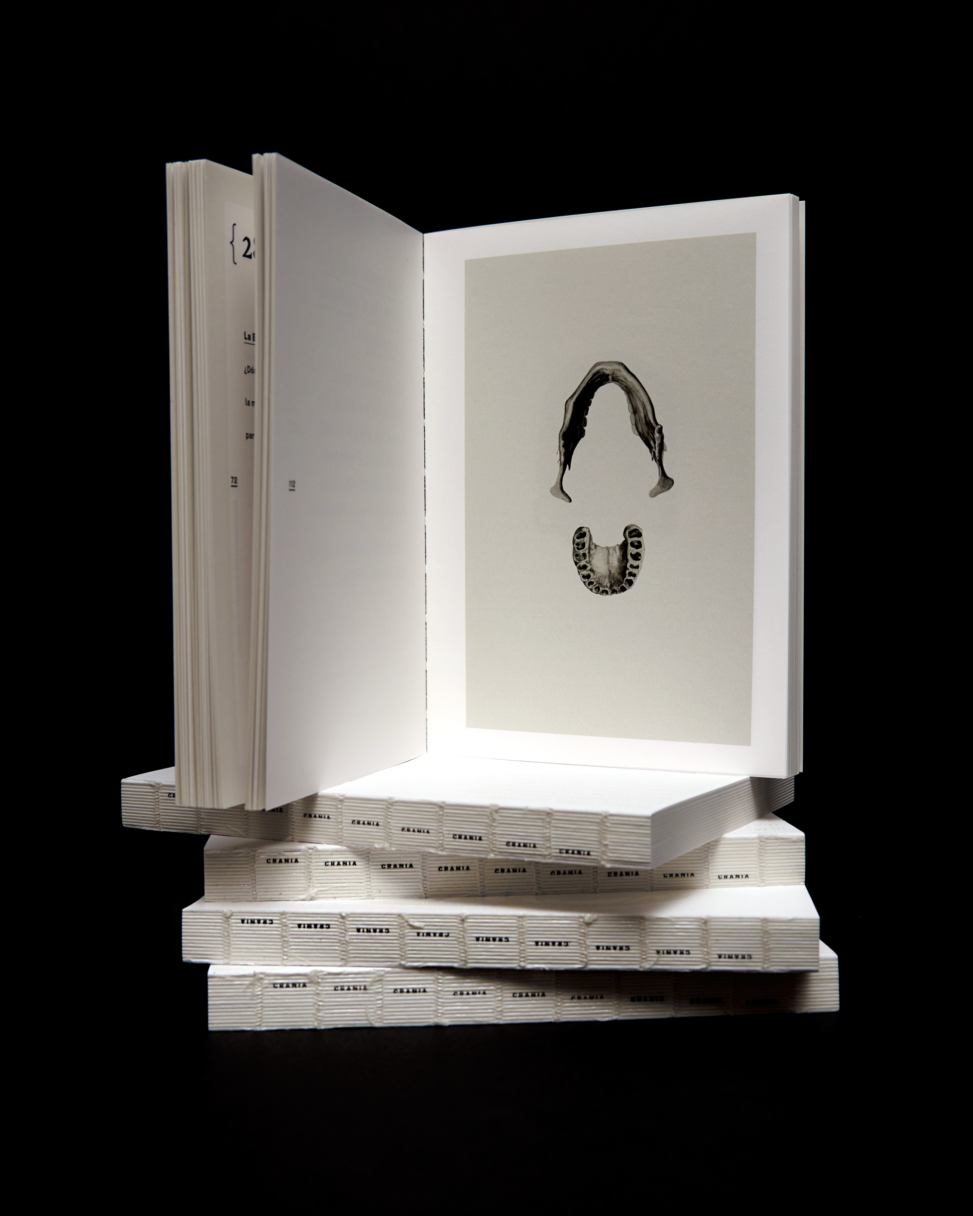
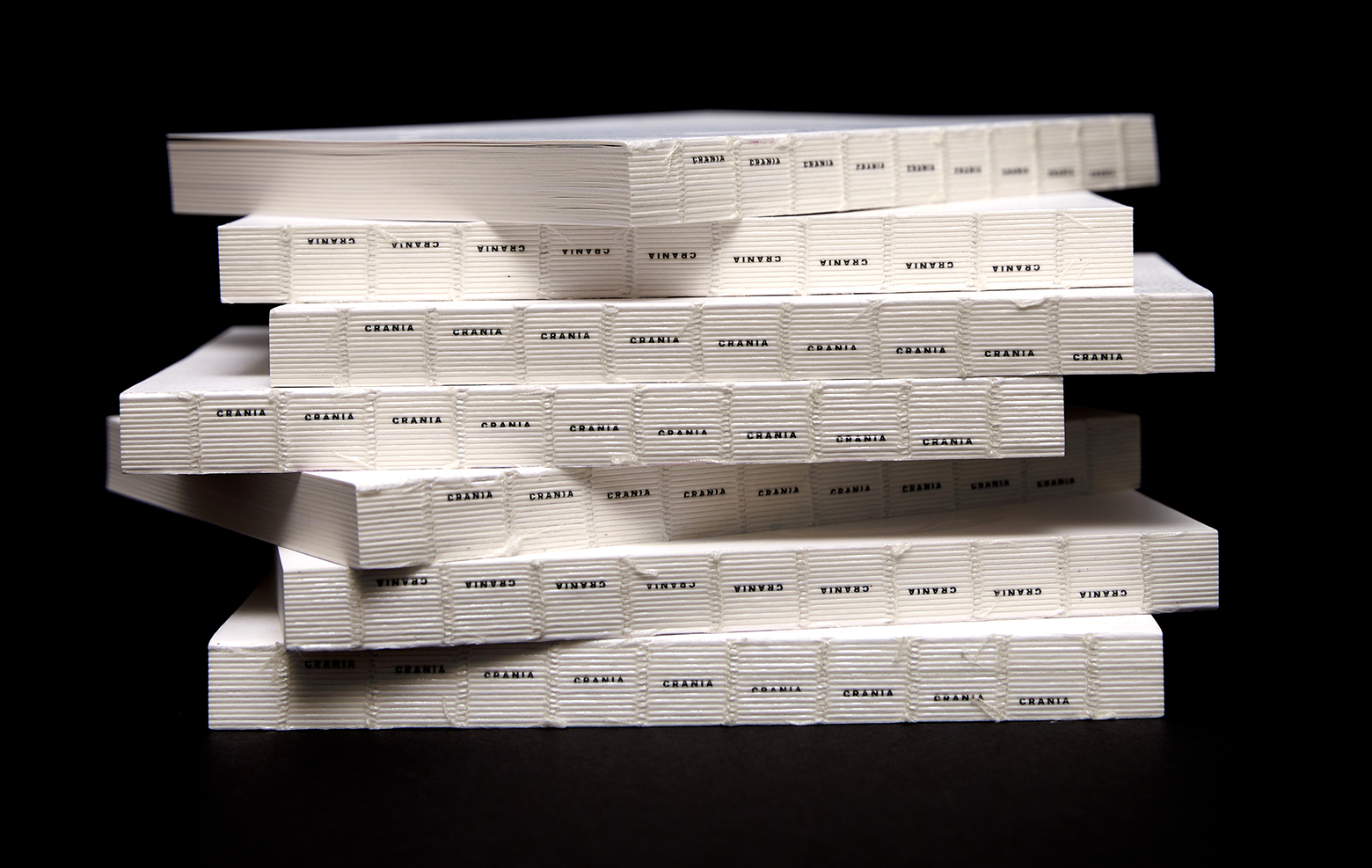
Formally, the book is meant to be perceived as a medical guide, or as a small encyclopedia. The pages lie flat with medical precision. We wanted to evoke the rawness of the texts in the binding details—the sewing and the thread, the exposed spine with printed signatures—and in the typographic selection—Public Sans, a geometric sans, and Labrada, a serif. One might think that there’s a fixed relationship between language and typographic style, but as the book evolves, these lines blur, and hierarchy, layout, and typographic styles morph and interact, making it hard to tell which language has predominance.
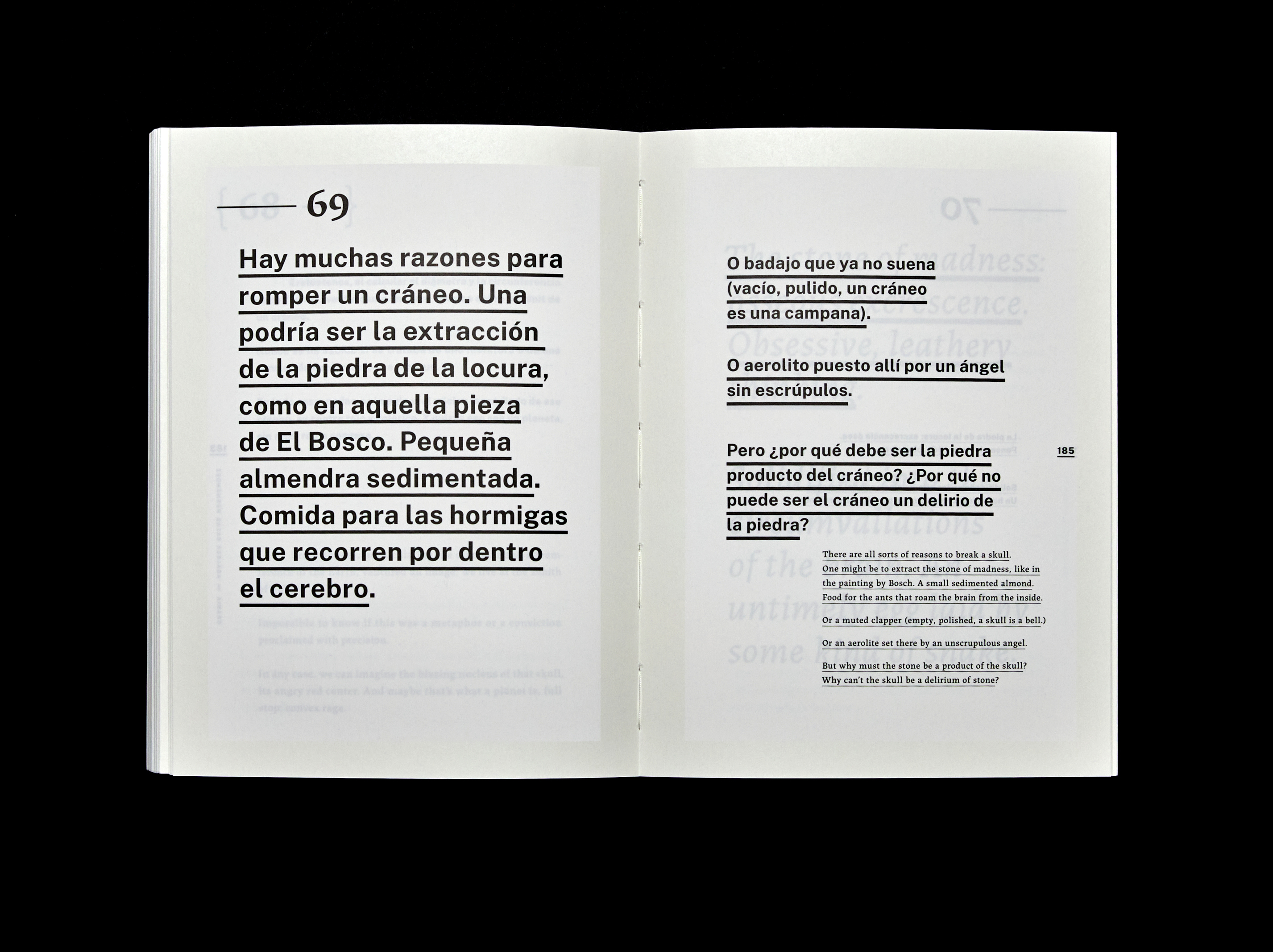
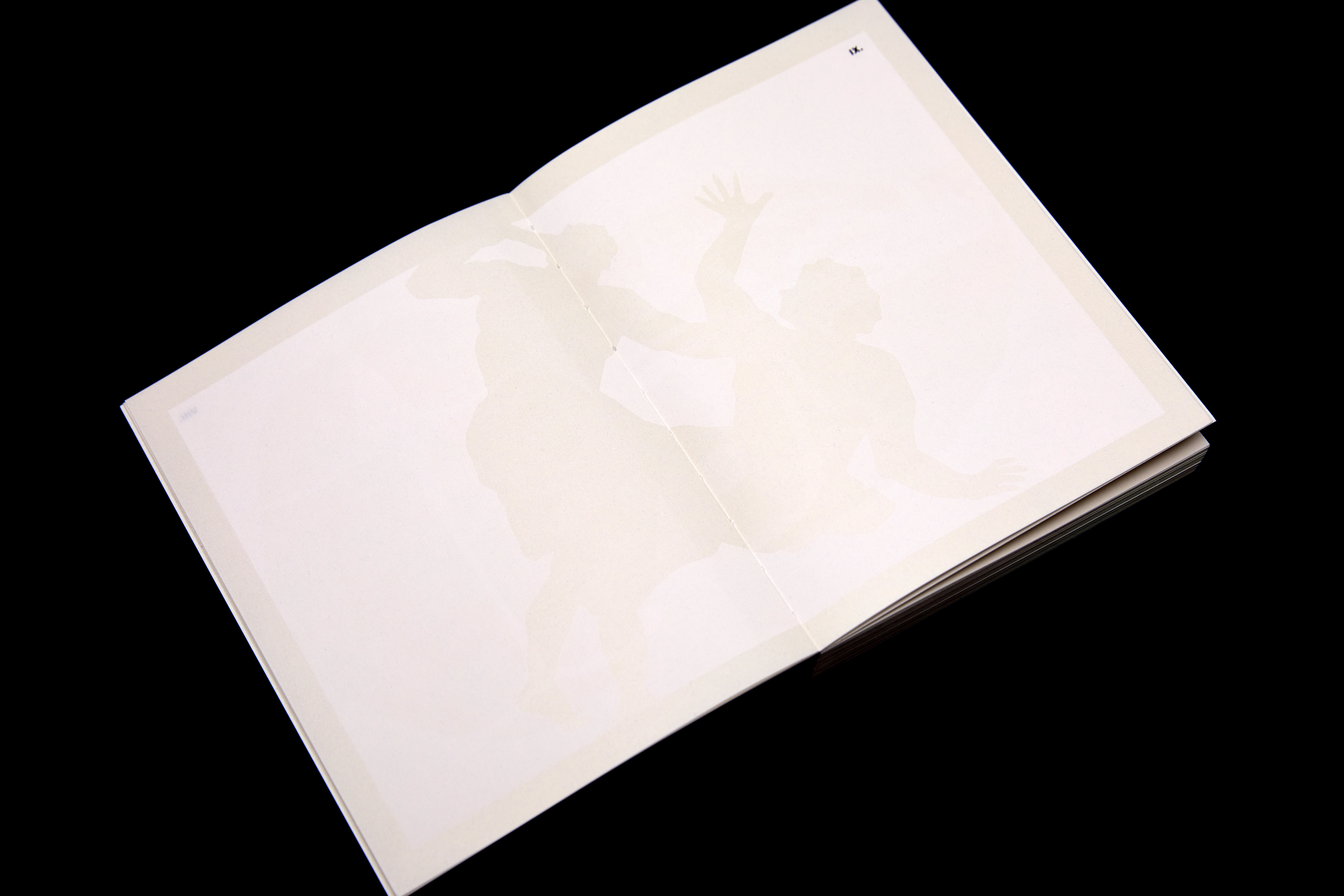
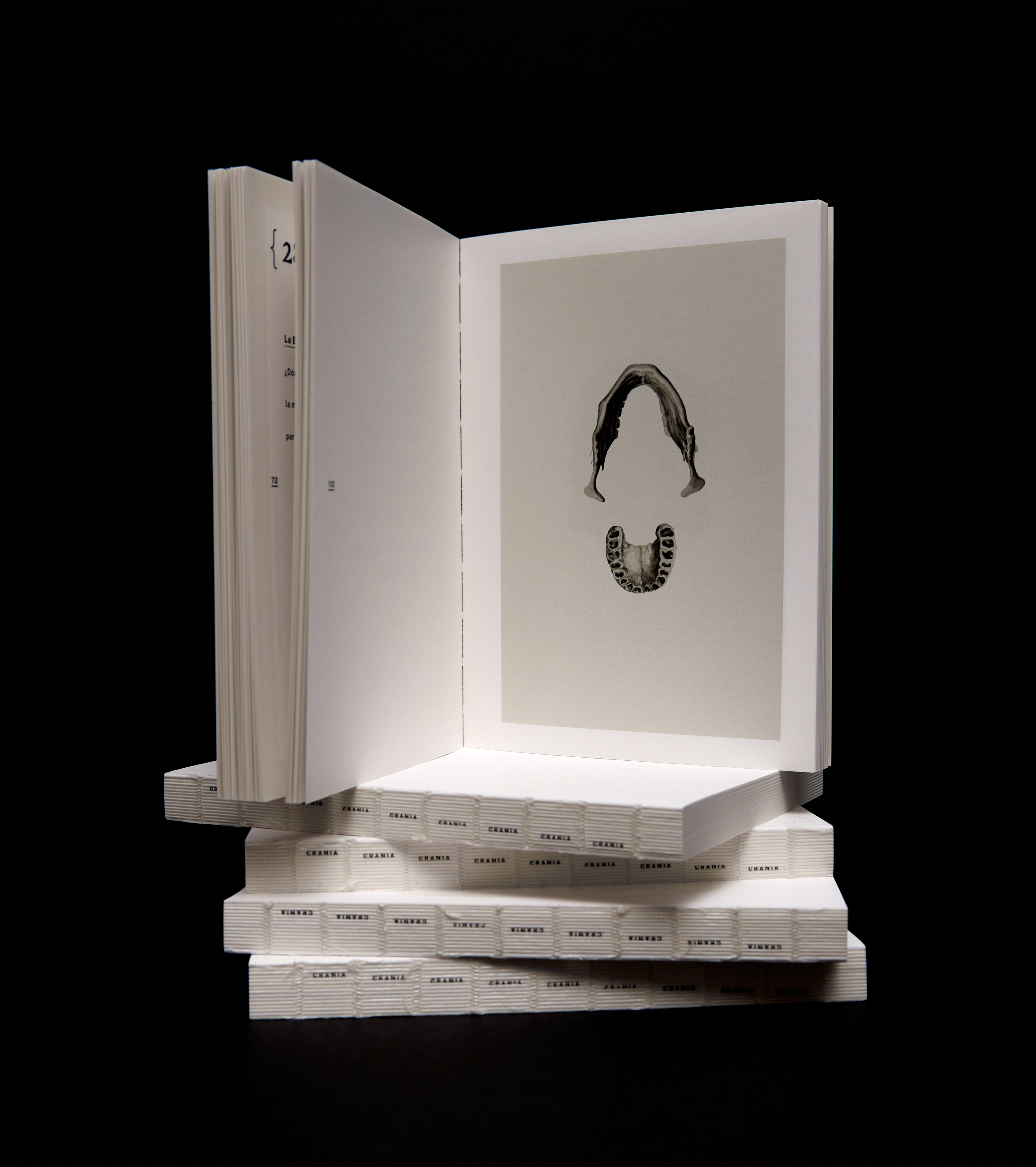
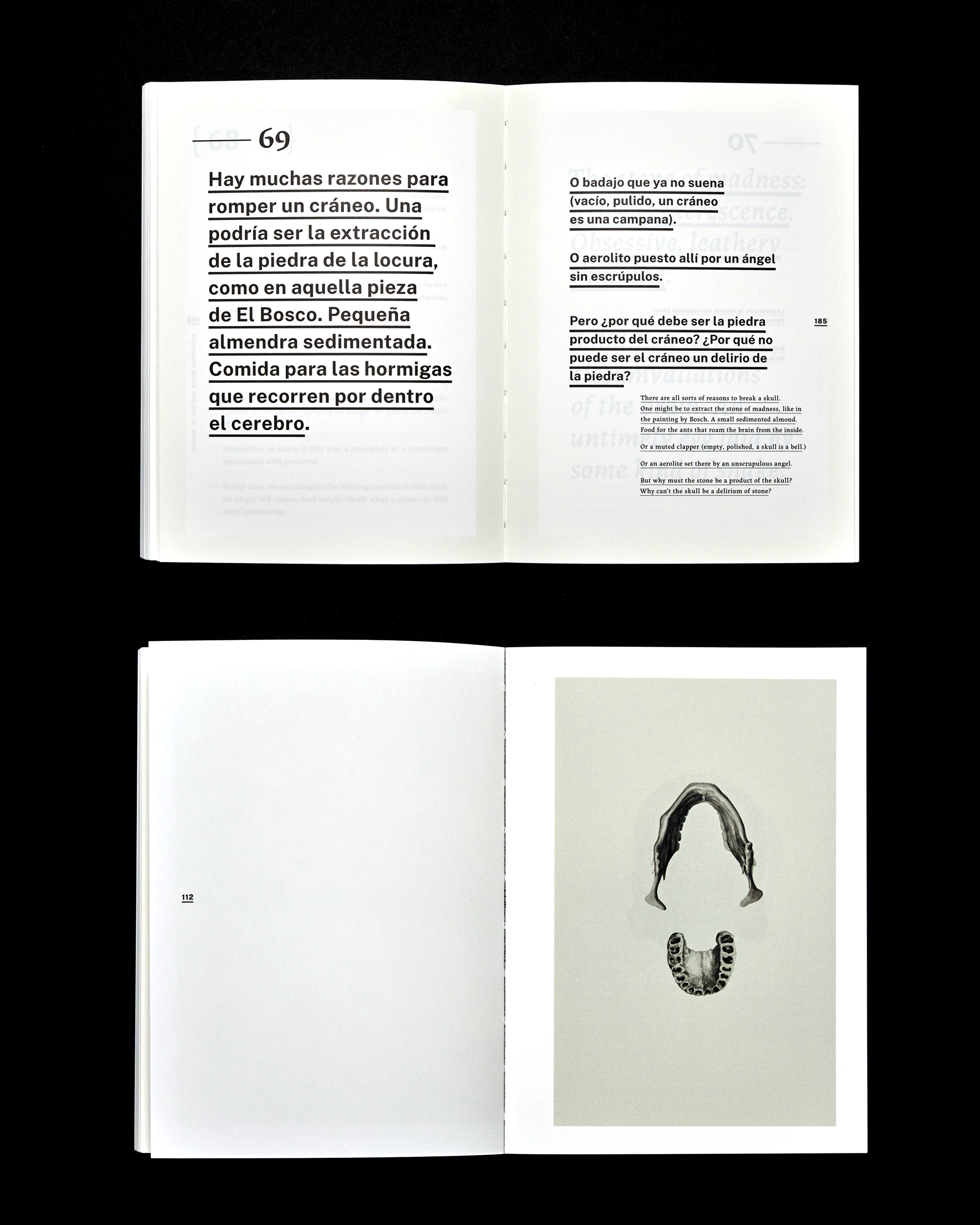
The first section includes images with some of the literary and historical references mentioned in the text, but merely as silhouettes printed in varnish. This varnish is also applied within the outer margins, emphasizing how books oxidize with time and giving off a warm sheen, the different textures and shades of bone.
Developed at Letra Muerta INC. Codesigned with Oriana Nuzzi.
